
Color plays a powerful role in how customers perceive your brand and interact with your storefront. The right color choices can influence emotions, drive purchasing decisions, and significantly improve visibility.
For businesses investing in retail sign colors NYC, understanding color psychology is essential to creating signage that not only looks good—but converts.
Why Color Matters in Retail Signage?
Studies show that color can impact customer decisions within seconds. In a fast-paced city like NYC, your signage must:
- Grab attention instantly
- Communicate brand identity
- Influence customer behavior
Well-designed storefront retail signage in NYC uses color strategically to stand out in crowded streets and competitive markets.
The Psychology Behind Popular Sign Colors
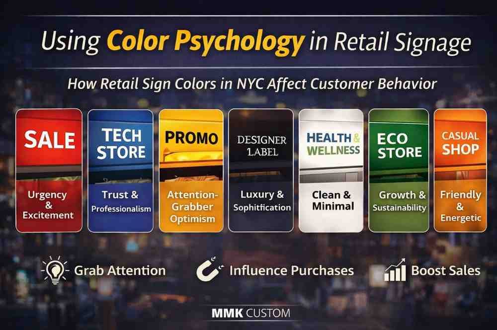
1. Red – Urgency and Excitement
Red is bold, energetic, and impossible to ignore.
Best for:
- Sales and promotions
- Food and beverage businesses
- Clearance signage
It creates a sense of urgency, making it perfect for driving impulse purchases.
2. Blue – Trust and Professionalism
Blue is associated with reliability and calmness.
Best for:
- Corporate retail stores
- Tech and service-based businesses
- High-end brands
Many brands use blue in custom signage systems to build trust and credibility.
3. Yellow – Attention-Grabbing and Optimistic
Yellow is bright and cheerful, making it highly visible.
Best for:
- Window displays
- Promotional signs
- Highlighting key messages
However, it should be used carefully to avoid overwhelming the design.
4. Black – Luxury and Sophistication
Black creates a premium and modern feel.
Best for:
- Luxury retail brands
- Fashion stores
- Minimalist signage
It pairs well with metallic materials often used in high-end retail signage.
5. White – Clean and Minimal
White conveys simplicity and clarity.
Best for:
- Modern branding
- Healthcare and wellness stores
- Interior signage
White backgrounds improve readability and contrast.
6. Green – Growth and Sustainability
Green represents health, nature, and eco-friendliness.
Best for:
- Organic products
- Wellness brands
- Eco-conscious businesses
It’s increasingly popular in NYC retail environments focused on sustainability.
7. Orange – Friendly and Energetic
Orange combines the energy of red with the friendliness of yellow.
Best for:
- Youth-focused brands
- Casual retail stores
- Calls-to-action
It encourages engagement and interaction.
How to Choose the Right Color Combination?
Choosing a single color isn’t enough—combination matters.
- Contrast is Key: High contrast improves readability from a distance
- Match Your Brand Identity: Colors should reflect your brand personality
- Consider Location: Outdoor signs need bolder, more visible colors
- Think About Lighting: Colors look different in daylight vs illuminated signage
Businesses that combine color strategy with insights from retail sign material selection in NYC achieve better long-term results.
Common Mistakes to Avoid
- Using too many colors (creates confusion)
- Poor contrast (reduces readability)
- Ignoring brand consistency
- Choosing trends over functionality
Effective signage is always a balance between creativity and clarity.
Why Color Psychology Improves ROI?
When used correctly, color can:
- Increase foot traffic
- Improve brand recognition
- Boost customer engagement
- Drive more sales
Retailers using strategic color choices in storefront signage solutions often see higher conversion rates.
Create Impactful Retail Signage with the Right Colors
Color isn’t just a design choice—it’s a business decision. The right color strategy can transform your signage into a powerful marketing tool. Enhance your brand with custom signage solutions tailored to your business identity.
Start your project with a custom signage quote request and get expert guidance on colors, materials, and design.