
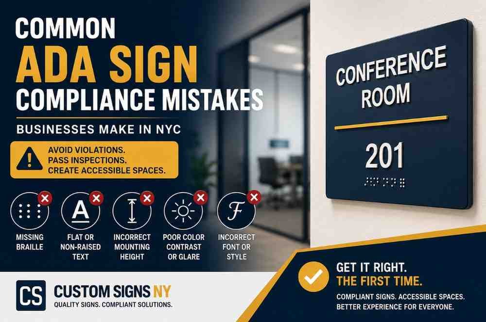

Whether you’re opening a new office, renovating a commercial space, or preparing for a building inspection, ensuring your signage meets accessibility standards is essential. Unfortunately, many businesses unknowingly make ADA signage mistakes that can lead to failed inspections, costly corrections, project delays, or even legal issues.
If you’re installing ADA compliance signs NYC businesses rely on, understanding the most common compliance errors can save both time and money.
This guide explains the mistakes businesses frequently make and how to ensure your signage complies with both the Americans with Disabilities Act (ADA) and applicable New York City building regulations.
Why ADA Sign Compliance Matters
ADA-compliant signs do more than satisfy legal requirements—they help create accessible spaces for employees, customers, and visitors with visual or mobility impairments.
Proper ADA signage helps businesses:
- Improve accessibility
- Support an inclusive customer experience
- Meet federal ADA requirements
- Reduce the risk of costly corrections
- Prepare for inspections with confidence
If you’re new to ADA requirements, read our complete guide to Understanding ADA Signage Requirements for New York Offices and Buildings.
Mistake #1: Installing Signs Without Braille
One of the most common ADA violations is forgetting to include Grade 2 Braille on permanent room identification signs.
Braille is typically required for spaces such as:
- Restrooms
- Conference rooms
- Offices
- Stairwells
- Mechanical rooms
- Electrical rooms
Without Braille, otherwise attractive signs may still fail compliance requirements.
How to avoid it: Always verify that permanent room signs include correctly positioned Grade 2 Braille beneath the raised tactile text.
Mistake #2: Using Flat Printed Letters Instead of Raised Characters
ADA signs require tactile characters that people can read by touch.
A common mistake is using printed vinyl lettering or flat graphics without raised text.
ADA-compliant tactile letters should:
- Be raised from the sign surface
- Maintain proper spacing
- Follow ADA sizing requirements
Raised lettering improves accessibility for individuals with visual impairments.
Mistake #3: Incorrect Mounting Height
Even perfectly designed signs can become non-compliant if installed incorrectly.
Signs are often mounted:
- Too high
- Too low
- Too close to door frames
Proper placement ensures consistency throughout a building.
Best practice: Install ADA signs according to the required mounting height and on the latch side of doors whenever applicable.
Mistake #4: Poor Color Contrast
ADA signage must be easy to read.
Low-contrast combinations such as:
- Gray on silver
- Beige on white
- Light blue on gray
can reduce readability.
Better combinations include:
- White on black
- Black on brushed aluminum
- Dark blue on white
High contrast improves visibility for everyone—not just individuals with visual impairments.
Mistake #5: Using Reflective or Glossy Finishes
Highly reflective materials may look attractive but can create glare under office lighting.
Excessive glare makes signs difficult to read.
ADA-compliant signs generally use non-glare finishes to improve visibility under different lighting conditions.
Mistake #6: Choosing Decorative Fonts
Fancy fonts may fit a brand’s style but can reduce readability.
For ADA-compliant signage, simple sans-serif fonts are generally preferred.
Common choices include:
- Helvetica
- Arial
- Frutiger
These fonts provide better legibility and tactile clarity.
Mistake #7: Incorrect Braille Placement
Even if Braille is included, improper positioning can create compliance issues.
Braille should be:
- Located beneath raised text
- Properly spaced
- Installed consistently across all signs
Attention to detail during fabrication is essential.
Mistake #8: Using ADA Signs Where They Aren’t Needed—or Missing Them Where They Are
Some businesses install ADA signs unnecessarily while overlooking areas where they’re actually required.
Permanent spaces commonly requiring ADA signage include:
- Restrooms
- Stairways
- Elevators
- Offices
- Conference rooms
- Exit routes
- Utility rooms
Temporary promotional signs and event notices typically have different requirements.
Knowing the difference helps avoid unnecessary expenses while maintaining compliance.
Mistake #9: Ignoring Building Renovations
Businesses often renovate offices without updating signage.
If you:
- Rename departments
- Relocate offices
- Add conference rooms
- Remodel your floor plan
your ADA signs should be reviewed and updated accordingly.
Keeping signage current helps maintain accessibility and accurate wayfinding.
Mistake #10: Hiring a Company Without ADA Expertise
Not every sign company specializes in ADA-compliant signage.
Choosing an experienced provider helps ensure:
- Proper tactile lettering
- Accurate Braille
- Correct material selection
- Professional fabrication
- Code-conscious installation
Working with specialists can reduce the likelihood of costly revisions later.
ADA Compliance Checklist
Before scheduling an inspection, confirm that your signage includes:
✅ Raised tactile lettering
✅ Grade 2 Braille
✅ High-contrast colors
✅ Non-glare finish
✅ Proper font selection
✅ Correct mounting location
✅ Consistent installation throughout the building
Using a checklist during your project can help identify issues before they become inspection problems.
Benefits of Proper ADA Signage
Installing compliant ADA signage offers advantages beyond meeting regulations.
Benefits include:
- Improved Accessibility: Visitors can navigate your building more independently.
- Professional Appearance: Consistent signage enhances your office environment.
- Better Customer Experience: Clear identification reduces confusion and improves wayfinding.
- Reduced Risk of Corrections: Installing compliant signs from the start can help avoid unnecessary rework.
- Long-Term Durability: Quality ADA signs are designed to withstand daily use while maintaining readability.
When Should Businesses Review ADA Signage?
It’s a good idea to review your ADA signage when:
- Opening a new location
- Renovating an office
- Rebranding your business
- Preparing for inspections
- Expanding into additional office space
- Updating wayfinding systems
Regular reviews help ensure your signage continues to meet accessibility needs.
Partner with ADA Signage Experts in NYC
Designing ADA-compliant signage requires careful attention to accessibility standards, material selection, fabrication, and installation.
At Custom Signs NY, we create custom ADA signs that combine code-conscious design with professional aesthetics. Whether you need Braille signs, office identification, restroom signage, or complete ADA wayfinding systems, our team can help.
👉 Request a Quote to discuss your ADA signage project.
Frequently Asked Questions
What are the most common ADA signage mistakes?
Common issues include missing Braille, flat printed lettering instead of tactile text, incorrect mounting height, poor color contrast, glossy finishes, and improper installation.
Do all business signs need to be ADA compliant?
No. ADA requirements primarily apply to permanent room identification and certain wayfinding signs. Promotional and temporary signs often follow different requirements.
Can decorative fonts be used on ADA signs?
Simple, easy-to-read fonts are generally recommended because they improve readability and accessibility.
Why is Braille required on ADA signs?
Braille helps individuals with visual impairments identify permanent rooms and navigate buildings more independently.
Can an experienced sign company help with ADA compliance?
Yes. A professional signage company familiar with ADA standards can assist with design, fabrication, material selection, and installation to help ensure compliance.