
Typography Tips for Effective Signage
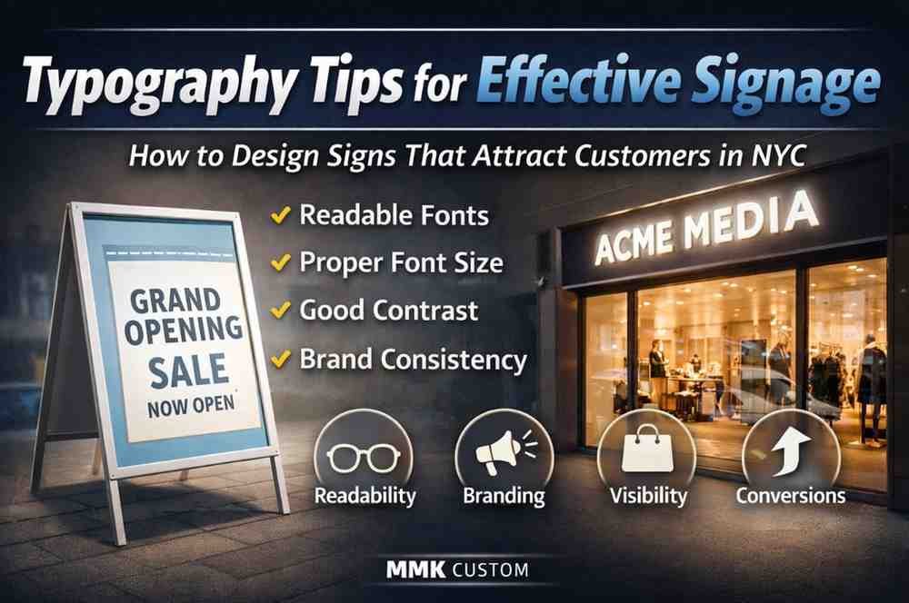
Typography plays a crucial role in how your signage communicates with customers. Whether it’s a storefront sign, office branding, or wayfinding system, the right font choice can improve readability, reinforce brand identity, and drive customer action. For businesses investing in custom signs and signage solutions, typography is not just about style—it’s about performance. Why Typography Matters in Signage? Good typography ensures your message is: In competitive markets like NYC, signage must grab attention instantly—making typography one of the most important design elements. 1. Choose Readable Fonts Over Decorative Ones While decorative fonts may look attractive, they often reduce readability—especially from a distance. Best Practice: Businesses focusing on interior signage solutions in NYC often prioritize readability to ensure clear navigation and communication inside offices and commercial spaces. 2. Focus on Font Size and Viewing Distance The size of your text should match the viewing distance. General Rule: For storefronts and large-scale displays, proper typography is essential in custom signage strategies to ensure visibility from passing traffic. 3. Maintain Strong Contrast Contrast between text and background is key for readability. Effective Combinations: Good contrast ensures your signage stands out in both daytime and nighttime conditions. 4. Limit the Number of Fonts Using too many fonts creates visual clutter and confusion. Best Practice: Consistent typography strengthens branding and improves customer recognition. 5. Pay Attention to Letter Spacing (Kerning) Proper spacing between letters improves readability and overall design balance. Tips: 6. Use Hierarchy to Guide Attention Typography should guide the viewer’s eye to the most important information first. Example: This structure helps customers quickly understand your message without confusion. 7. Align Typography with Your Brand Identity Your font choice should reflect your brand personality. Examples: Businesses investing in custom signs and branding solutions often use typography to create a lasting impression and reinforce brand identity. 8. Avoid ALL CAPS Overuse While uppercase text can be powerful, overusing it reduces readability. Best Practice: 9. Test Your Signage in Real Conditions Before finalizing your signage: This step ensures your typography performs well in real-world environments. 10. Keep It Simple and Clear The most effective signage is simple and easy to understand. Remember: Clear typography leads to better engagement and higher customer response. How Typography Impacts Business Results? Well-designed typography can: Whether it’s a storefront, office, or retail space, typography directly affects how customers interact with your business. Upgrade Your Signage with Better Typography If you want signage that stands out and delivers results, typography should be a top priority. From font selection to layout and spacing, every detail matters. Start your project with a custom signage quote request and bring your vision to life with expert design and execution.