
Typography is one of the most important yet overlooked elements of effective signage. A beautifully fabricated sign can still fail if customers struggle to read the text. For businesses competing in New York City, choosing the right fonts can significantly impact visibility, brand recognition, and customer engagement.
Whether you’re designing storefront signs, office lobby signs, channel letters, or window graphics, understanding business sign typography NYC best practices can help maximize your signage investment.
Why does typography matter in Signage?
Your font choice affects:
- Readability
- Brand perception
- Visibility from a distance
- Customer trust
- First impressions
- Overall sign effectiveness
The best business signs communicate information instantly. If pedestrians or drivers cannot quickly read your sign, you risk losing potential customers.
Professional businesses often work with custom signage design services to ensure typography supports both branding and functionality.
Characteristics of Effective Signage Fonts
Before choosing a font, it’s important to understand what makes typography work well for signs.
Great signage fonts should be:
- Easy to Read: Letters should remain clear from various distances and viewing angles.
- Bold and Distinct: Thin strokes often disappear when viewed from across the street.
- Scalable: The font should maintain readability whether displayed on small plaques or large storefront signs.
- Timeless: Trendy fonts can quickly look outdated. Most businesses benefit from clean, professional typography.
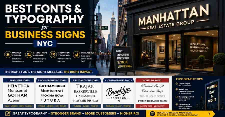
Best Font Categories for Business Signs
1. Sans-Serif Fonts
Sans-serif fonts are among the most popular choices for modern business signage.
Examples include:
- Helvetica
- Montserrat
- Futura
- Avenir
- Gotham
Benefits:
- Clean appearance
- Excellent readability
- Modern aesthetic
- Effective for large-format signs
These fonts are widely used in retail stores, corporate offices, and professional service businesses.
2. Bold Geometric Fonts
Geometric fonts create a strong, contemporary appearance while maintaining visibility.
Popular choices:
- Gotham Bold
- Proxima Nova
- Montserrat Extra Bold
- Nexa Bold
These fonts work exceptionally well for:
- Channel letter signs
- Building signs
- Retail storefronts
- Corporate branding
3. Elegant Serif Fonts
Serif fonts can communicate sophistication and tradition.
Examples:
- Garamond
- Baskerville
- Trajan
- Playfair Display
Commonly used by:
- Law firms
- Luxury brands
- Financial institutions
- High-end real estate companies
When using serif fonts on signage, readability should remain the top priority.
4. Custom Brand Typography
Many companies develop custom typography to strengthen brand identity.
Custom fonts can:
- Differentiate your business
- Improve recognition
- Create a unique visual presence
However, custom typefaces should still follow signage readability principles.
Fonts to Avoid on Business Signs
Certain fonts often reduce effectiveness.
Avoid:
- Overly Decorative Fonts: Complex scripts may look attractive but can become difficult to read at a distance.
- Thin Fonts: Ultra-light typography often loses visibility in outdoor conditions.
- Excessive Script Fonts: Handwritten-style fonts can hurt readability, particularly for storefront signage.
- Trend-Based Fonts: Highly stylized fonts may age quickly and require costly redesigns later.
Typography Rules for NYC Storefront Signs
Busy NYC streets create unique visibility challenges.
Prioritize Distance Readability
Pedestrians and drivers should understand your sign within seconds.
Use Strong Contrast
Typography should stand out clearly against the background.
Examples:
- White letters on dark backgrounds
- Black letters on light backgrounds
- Illuminated lettering for nighttime visibility
Limit Font Choices
Most signs should use no more than two fonts.
Too many font styles create visual clutter and weaken branding.
Maintain Proper Letter Spacing
Crowded letters become difficult to read, especially on illuminated signs.
For additional design guidance, businesses can review these typography tips for signage when planning custom signs.
Best Font Pairings for Business Signs
Modern Corporate
- Headline: Montserrat Bold
- Secondary Text: Open Sans
Luxury Brand
- Headline: Playfair Display
- Secondary Text: Montserrat
Retail Store
- Headline: Gotham Bold
- Secondary Text: Avenir
Professional Services
- Headline: Helvetica Bold
- Secondary Text: Helvetica Regular
These combinations balance readability and aesthetics.
How Does Typography Impact Branding?
Typography influences how customers perceive your business.
Modern Fonts Communicate
- Innovation
- Simplicity
- Technology
- Professionalism
Serif Fonts Communicate
- Trust
- Tradition
- Authority
- Luxury
Custom Fonts Communicate
- Uniqueness
- Creativity
- Strong brand identity
Successful signage aligns typography with your overall business personality.
Businesses often combine effective typography with proven storefront branding examples to create stronger customer recognition.
Typography and Illuminated Signs
For illuminated signage, typography becomes even more important.
The best fonts for illuminated signs feature:
- Bold strokes
- Open letterforms
- Balanced spacing
- Strong visibility at night
Fonts with overly intricate details can become difficult to distinguish when backlit.
Final Thoughts
Choosing the right business sign typography that NYC businesses rely on can dramatically improve visibility, customer engagement, and brand recognition. While colors, materials, and lighting matter, typography is often the factor that determines whether your sign communicates effectively.
From modern sans-serif fonts to elegant serif lettering and custom brand typefaces, selecting the right typography ensures your sign remains readable, professional, and memorable for years to come.
If you’re planning a new storefront, office sign, or branding project, you can request custom sign design and work with signage professionals to create typography that strengthens your brand presence.
FAQ
What is the best font for business signs?
Sans-serif fonts such as Helvetica, Montserrat, Gotham, and Futura are often considered the best because they offer excellent readability and modern appeal.
Are serif fonts good for signage?
Yes. Serif fonts can work well for luxury brands, law firms, and financial institutions, provided readability remains strong.
How many fonts should a business sign use?
Most professional signs should use one or two font families to maintain consistency and avoid visual clutter.
What font size is best for storefront signs?
Font size depends on viewing distance, but larger, bold lettering generally improves visibility and readability.