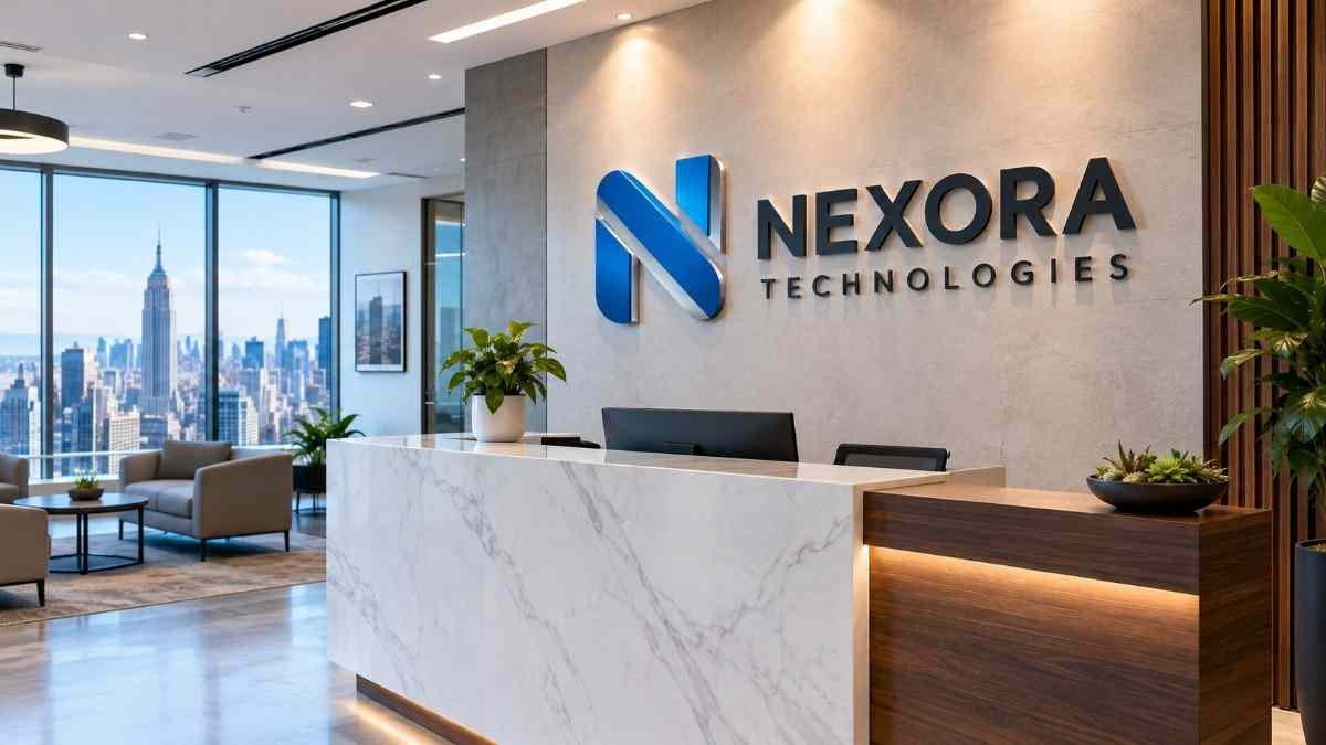

Your office reception area is often the first place clients, visitors, and business partners experience your brand in person. Before a meeting begins or a conversation starts, your reception area’s design can shape how people perceive your business. One effective way to make a professional first impression is with 3D office logo signs. Unlike flat printed graphics, dimensional logo signs add depth, texture, and visual interest to reception walls. They help display your company identity while complementing your interior design.
For NYC businesses, reception signage needs to do more than display a company name. It should reflect the brand’s personality, suit the surrounding architecture, and look appropriate in the space where clients are welcomed.
From brushed metal lettering in a Manhattan law firm to colorful acrylic logos in a technology company’s office, the right combination of materials, finishes, placement, and lighting can transform an ordinary wall into a distinctive brand feature.
In this guide, we explore practical 3D office logo sign ideas, material choices, wall backgrounds, lighting options, and design considerations to help you plan reception signage for your business.
Why Choose 3D Logo Signs for Office Reception Areas?
A reception logo is a permanent part of your office environment. It can reinforce brand recognition, create a polished setting for meetings, and make your space feel more cohesive.
- Create a Professional First Impression: A dimensional logo gives your reception area a finished, intentional appearance. Carefully selected materials and finishes can communicate professionalism without making the space feel overly decorative. For businesses that regularly welcome clients, investors, vendors, or prospective employees, reception signage is an opportunity to present a consistent brand identity.
- Make Your Brand More Visible: Three-dimensional letters and logos create natural shadows and highlights as light falls across their surfaces. This depth can help your brand stand out against the wall, particularly when the logo contrasts with the background. The effect depends on letter thickness, material, lighting, and viewing distance.
- Complement Your Office Interior: Reception signs can be designed to coordinate with wall panels, furniture, flooring, glass partitions, and architectural details. For example, brushed metal letters may complement a modern corporate interior, while acrylic logo lettering can introduce brand colors into a minimalist reception space.
- Support Consistent Brand Identity: Your reception logo should reflect the same visual identity used on your website, marketing materials, business cards, and other branded touchpoints. Consistent colors, proportions, typography, and logo placement help visitors recognize your company across different environments.
For more ideas, explore our custom interior signage for NYC offices service page.
1. Choose the Right Material for Your 3D Office Logo
Material selection affects the appearance, weight, finish, cost, and installation requirements of your reception sign. The best choice depends on your logo, wall surface, interior style, and budget.
Acrylic Logo Signs
Acrylic is a popular choice for modern office reception areas because it offers flexibility in colors, thicknesses, and finishes. It works particularly well for companies that want their logo reproduced in brand-specific colors or need custom shapes that go beyond standard lettering.
Best suited for:
- Technology companies and startups
- Creative agencies
- Professional service offices
- Retail and hospitality headquarters
- Colorful brand logos
- Contemporary reception walls
Glossy acrylic can create a vibrant look, while matte finishes offer a more understated appearance. Clear and translucent acrylic may also suit selected layered or illuminated designs.
Stainless Steel Logo Signs
Stainless steel letters offer a refined, architectural appearance. Brushed finishes create a subtle texture, while polished finishes reflect more light. These signs can work well in corporate offices where the goal is a clean, professional reception environment.
Best suited for:
- Law firms
- Financial services companies
- Consulting firms
- Corporate headquarters
- Real estate offices
- Executive reception areas
Stainless steel is also used for selected exterior signage, although the appropriate grade and finish should be specified for the environment.
Aluminum Logo Signs
Aluminum provides a versatile option for dimensional lettering. It can be finished in different colors and textures and is generally lighter than comparable solid steel designs. Aluminum may suit businesses that want a contemporary metal appearance without the weight of some alternative metal constructions.
Best suited for:
- Corporate reception signs
- Office identification
- Large dimensional lettering
- Modern commercial interiors
- Custom logo designs
Brass and Bronze-Finish Letters
Brass and bronze finishes can introduce warmth and a traditional or luxury-inspired appearance to reception signage. They may be suitable for hospitality businesses, premium professional offices, private clubs, and brands whose visual identity calls for a more classic look.
The exact appearance depends on the material, coating, finish, and maintenance requirements. A bronze-colored finish is not necessarily solid bronze, so confirm the material specification when requesting a quote.
PVC and Other Dimensional Materials
PVC and other suitable sign-making materials can be useful when the design calls for lightweight dimensional lettering and a painted finish. They may suit offices that want a clean, custom logo without requiring a genuine metal surface. The material should be selected according to the intended appearance, size, mounting method, and installation environment.
For a broader comparison, see our custom 3D letters and logo signage options.
2. Match the Finish to Your Brand Personality
The finish of your logo sign influences how it looks under office lighting and how it complements the surrounding space.
- Brushed Metal for a Refined Corporate Look: Brushed stainless steel or aluminum has a subtle linear texture that can reduce the appearance of strong reflections compared with highly polished surfaces. It works well with neutral walls, stone finishes, glass partitions, and contemporary office furniture.
- Glossy Acrylic for Bold Brand Colors: Glossy acrylic can make logo colors more prominent and create a clean, modern appearance. This finish is worth considering when your brand relies on bright colors or when the reception wall needs a strong visual focal point.
- Matte Finishes for Minimalist Interiors: Matte finishes create a more subdued effect. They can suit minimalist offices where the goal is to maintain a restrained, professional appearance. Consider the contrast between the logo and the wall to ensure the lettering remains visible from the reception entrance.
- Gold and Brass Tones for Premium Branding: Gold and brass tones can add warmth and visual distinction. They are often paired with dark stone, charcoal walls, rich wood, or carefully selected neutral backgrounds. Use these finishes in proportion to the rest of the interior so the reception sign feels integrated rather than overpowering.
- Painted Finishes for Brand Consistency: Painted metal and other paintable sign materials can help match specific brand colors. The result depends on the substrate, paint system, lighting, and final finish. When exact color consistency matters, confirm the approved color specification and request a sample or proof before fabrication.
3. Select a Wall Background That Makes Your Logo Stand Out
The wall behind your reception logo is as important as the lettering itself. A suitable background creates contrast, supports readability, and helps the logo feel like part of the interior design.
Logo Signs on Stone or Marble Walls
Stone and marble backgrounds can create a premium architectural setting. Metal letters often complement these surfaces, particularly when the colors and textures are coordinated. Consider the wall’s natural veining and texture when selecting letter size and finish. A visually busy background may require simpler lettering or stronger contrast.
Logo Signs on Painted Walls
A painted wall offers flexibility and can work with almost any sign material. Light-colored walls can pair well with dark metal or bold acrylic letters. Dark walls can provide contrast for light-colored acrylic, brushed metal, or selected illuminated lettering.
Before choosing a finish, evaluate the wall under the actual lighting conditions in the reception area.
Logo Signs on Wood Panels
Wood and wood-look panels can make a reception space feel warm and welcoming. Metal letters can create contrast against the grain, while selected acrylic designs can introduce brand colors. Pay attention to panel seams, grain direction, and the wall’s structural suitability for mounting.
Logo Signs on Glass
Glass partitions can support modern, minimalist branding. Depending on the installation, letters may be mounted directly to a suitable surface or positioned on a separate backing panel. Glass installations require careful consideration of mounting hardware, visibility, and safety. Confirm that the proposed fixing method is appropriate for the specific glass system.
Logo Signs on Textured or Decorative Walls
Textured walls can add character, but deep textures may affect how letters sit against the surface. For uneven surfaces, a sign designer may recommend spacers, a backing panel, or an alternative mounting approach to achieve a clean result.
Design tip: Always evaluate the sign and wall as a complete composition. A beautiful logo can lose impact if its colors blend into the background or the lettering competes with decorative features.
4. Add Lighting for Greater Visual Impact
Lighting can change how a 3D logo looks throughout the day and under different office conditions. However, not every reception sign needs illumination.
Non-Illuminated 3D Logo Signs
Non-illuminated signs rely on the material’s surface, dimensional depth, ambient lighting, and contrast with the wall. They can be ideal for offices with good natural light or carefully designed overhead lighting.
This approach may also suit businesses that prefer a restrained aesthetic or want to avoid additional electrical components.
Halo-Lit Logo Signs
Halo-lit signs typically use lighting behind dimensional letters so light reflects onto the wall and creates a glow around the characters. This effect can work particularly well with suitable metal letter constructions in executive reception areas and premium office interiors.
The final result depends on the letter depth, spacing from the wall, lighting arrangement, wall finish, and ambient brightness.
Illuminated Acrylic Logo Signs
Certain acrylic sign designs can transmit light through the material or use lighting to highlight selected parts of the logo. These designs can suit brands that want a contemporary reception feature with greater visual emphasis.
The lighting effect should be planned alongside the logo colors and material selection to avoid unwanted color shifts or uneven illumination.
Lighting Considerations for Office Reception Signs
Before choosing an illuminated design, consider:
- Whether the reception area has natural light
- How the logo looks under evening or low-light conditions
- Whether the wall surface reflects light evenly
- The availability of suitable electrical connections
- Access for maintenance
- Whether illumination suits the company’s brand identity
Lighting should enhance readability and appearance rather than distract visitors. For related options, explore our acrylic backlit signs in NYC page.
5. Where Should You Place Your 3D Reception Logo?
Logo placement affects visibility, proportion, and the overall balance of the reception area.
Behind the Reception Desk
The wall directly behind the reception desk is one of the most common locations for a company logo. This placement makes the brand visible to visitors as they enter and can provide a consistent backdrop for conversations, meetings, and professional photography.
Make sure the logo is visible above the desk and is not obscured by monitors, decorative objects, lighting fixtures, or furniture.
On the Main Entrance Wall
Some offices have a feature wall near the entrance rather than directly behind the reception desk. A logo positioned here can create an immediate visual introduction to the brand. Consider how visitors approach the space and whether the sign is visible from the entrance door.
In a Lobby or Shared Reception Area
Businesses in multi-tenant buildings may share a reception or lobby environment. In these spaces, logo size, mounting permissions, building guidelines, and visibility from the main circulation path can influence the design.
Where the reception is shared, confirm building management requirements before finalizing fabrication.
On a Feature Wall
A dedicated feature wall can give the logo room to stand out without competing with other information. This approach works well when the wall has a distinctive finish, integrated lighting, or a simple architectural treatment.
How High Should a Reception Logo Be Mounted?
There is no single mounting height suitable for every office. The correct position depends on the logo’s dimensions, viewing distance, wall size, reception desk height, and typical visitor sightlines. Create a scaled layout or use a full-size placement template before installation. This helps confirm the sign’s position relative to the desk, furniture, and architectural features.
6. Choose the Right Logo Size and Proportions
A reception logo should be large enough to read comfortably without overwhelming the wall. A small logo may disappear on a wide feature wall, while an oversized design can make a compact reception area feel crowded.
When planning the dimensions, consider:
- The total width and height of the logo
- Letter height and thickness
- The proportions of the symbol and wordmark
- The width of the reception desk
- The distance from the entrance
- The amount of space around the logo
- Other design elements on the wall
Do not stretch or compress the logo simply to fill the available space. Maintain the brand’s approved proportions. If the company logo includes a complex symbol and a long wordmark, consider whether the design works better as one horizontal composition or as a more compact arrangement.
A visual proof can help you evaluate these options before fabrication begins.
7. 3D Logo Sign Ideas for Different NYC Businesses
Different industries have different branding needs. Here are several practical directions to consider.
Law Firms and Financial Offices
Brushed stainless steel, aluminum, and selected brass finishes can create a restrained, professional appearance. A clean logo on a stone, wood, or neutral painted wall may be appropriate for firms that want their reception area to feel established and dependable.
Technology Companies and Startups
Colored acrylic, layered dimensional logos, and selected illuminated effects can help express a modern brand identity. The design should still prioritize readability and consistency with the company’s visual system.
Medical and Professional Practices
Simple lettering, clean surfaces, and easy-to-read logos can support a professional reception environment. Material selection should account for cleaning practices, the surrounding finishes, and the desired visual tone.
Real Estate and Architecture Firms
Metal letters, dimensional wordmarks, and carefully selected wall backgrounds can complement offices where presentation and design are central to the brand. The logo’s scale should suit the reception architecture without dominating the space.
Hotels, Hospitality, and Premium Retail
Brass tones, polished metal, and selected backlit designs can create a distinctive reception feature. Consider how the sign coordinates with lighting, furniture, stone, and other decorative elements.
Creative Agencies and Marketing Companies
Custom-colored acrylic, layered lettering, and distinctive logo shapes may suit agencies that want their reception area to express their creative identity. The best design is one that reflects the brand rather than simply following a trend.
8. Common Mistakes to Avoid When Designing 3D Office Logo Signs
A good design can lose its impact when important details are overlooked.
- Choosing Materials Without Considering the Wall: A material that looks excellent on one background may have poor contrast on another. Review the sign and wall together before fabrication.
- Making the Logo Too Small: Visitors should be able to recognize the logo from the entrance or normal approach path. Check the proposed size at the actual viewing distance.
- Using Too Many Finishes: Combining multiple materials, colors, and lighting effects can make the sign feel cluttered. Keep the design consistent with the company’s brand guidelines.
- Overlooking Lighting Conditions: A finish may appear different under daylight, warm lighting, and cool office lighting. Review the proposed material under realistic conditions.
- Ignoring Mounting Requirements: Wall construction, glass systems, surface condition, letter weight, and mounting hardware all influence the installation method.
- Treating the Logo as a Separate Design Element: The logo should coordinate with the reception desk, wall finish, furniture, lighting, and other branded elements.
- Approving Artwork Without Reviewing a Proof: Check spelling, logo proportions, color, dimensions, material, finish, and placement before authorizing fabrication.
9. What Affects the Cost of 3D Office Logo Signs?
The price of a custom reception logo depends on the complete project specification. A small acrylic logo and a large fabricated metal logo with illumination involve different materials, fabrication processes, and installation requirements.
Important cost factors include:
- Material: Acrylic, aluminum, stainless steel, and brass have different material and finishing requirements.
- Logo size: Larger signs typically require more material and may need additional mounting considerations.
- Letter depth and construction: Dimensional depth, fabricated returns, and complex shapes can affect fabrication time.
- Finish: Brushed, polished, painted, and specialty finishes may have different costs.
- Illumination: Lighting components, electrical work, and installation can add complexity.
- Wall surface: Stone, masonry, glass, and decorative panels may require different mounting approaches.
- Installation conditions: Site access, working hours, building requirements, and installation height can influence labor.
For an accurate estimate, provide the sign company with your logo artwork, approximate dimensions, preferred material, wall type, and installation location.
You can explore our custom interior signage services or request a quote for your reception logo project.
10. How to Plan Your Office Reception Logo Sign
A clear process helps avoid design changes and installation problems.
Step 1: Define Your Branding Goals
Decide whether the sign should feel corporate, contemporary, premium, creative, or understated.
Step 2: Share Your Logo and Brand Guidelines
Provide vector artwork when available, along with approved colors and typography. This helps the sign designer preserve the logo’s proportions and details.
Step 3: Evaluate the Wall and Installation Site
Confirm the wall dimensions, surface material, available mounting points, and any building restrictions.
Step 4: Select Materials and Finishes
Compare samples or proofs to understand how the selected materials will look in your reception area.
Step 5: Approve the Design and Dimensions
Review the artwork, size, color, finish, mounting method, and lighting specifications before production.
Step 6: Arrange Professional Installation
Confirm installation access, timing, wall preparation, electrical requirements if applicable, and any necessary approvals.
This process helps ensure the finished sign suits the space and accurately represents your brand.
Frequently Asked Questions
What are the best materials for 3D logo signs for offices?
Acrylic, aluminum, stainless steel, brass, and other suitable dimensional materials can work well. The best choice depends on the desired appearance, brand colors, wall surface, size, budget, and installation requirements.
Are 3D logo signs suitable for small office reception areas?
Yes. A carefully proportioned dimensional logo can work in a compact reception area. Use appropriate letter sizing, clear contrast, and enough space around the logo to prevent the wall from feeling crowded.
Should I choose acrylic or metal letters for my office logo?
Acrylic is useful for brand colors and contemporary designs, while metal is often selected for genuine metallic finishes and an architectural appearance. Compare the materials against your wall finish, budget, and brand identity.
Can office reception logo signs be illuminated?
Yes. Depending on the construction, options may include halo-lit metal letters or illuminated acrylic designs. The appropriate approach depends on the logo, wall, electrical access, and intended lighting effect.
How large should a 3D reception logo be?
The ideal size depends on the wall dimensions, viewing distance, desk placement, and logo proportions. A scaled proof or full-size template can help establish the correct dimensions.
Can a sign company fabricate a 3D logo from my existing artwork?
In many cases, yes. Vector logo files are especially useful, but the artwork may need adaptation for dimensional fabrication. Very fine details may not translate directly into small physical lettering.
How much do 3D office logo signs cost in NYC?
The cost depends on material, dimensions, construction, finish, lighting, mounting, and installation. Providing artwork and site details helps a sign company prepare a project-specific quote.
Can 3D logo signs be installed on glass or stone walls?
Yes, depending on the surface and mounting system. Glass and stone installations require appropriate fixing methods and a site assessment to ensure the sign can be installed safely and securely.
Conclusion
3D logo signs for office reception areas can help NYC businesses create a more polished, recognizable, and professional environment. The right combination of material, finish, lighting, wall background, and placement makes the logo feel like a natural part of the space rather than an afterthought.
Acrylic can provide color flexibility and a contemporary look, while metal letters can introduce a refined architectural finish. Both can work well when selected for the specific design and installation conditions.
Before moving into fabrication, consider how visitors will see the logo, how it complements your interior, and how the material supports your brand identity.
Planning a reception logo for your NYC office? Explore our custom interior signage services and 3D letters and logo signage to find a suitable direction for your project, or request a custom signage quote.